An image of a field saves no money on its own. What saves money is the decision that follows from it: not pouring nitrogen where it’s no longer needed, and not driving a hundred hectares for one problem hollow. Let’s unpack how a picture from space turns into two very down-to-earth things: an application rate and a point on the agronomist’s route.
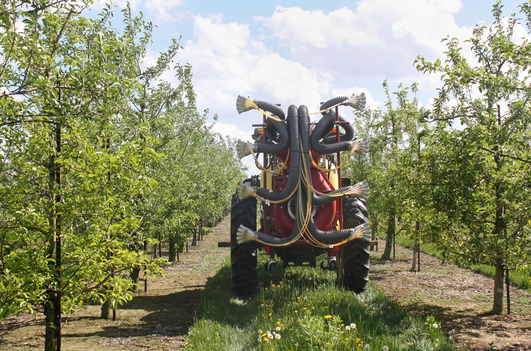
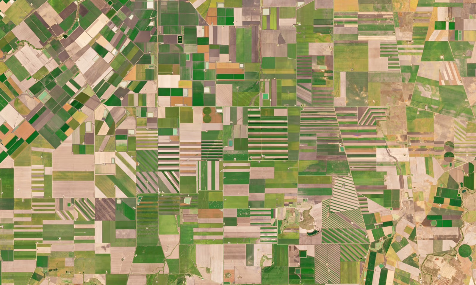
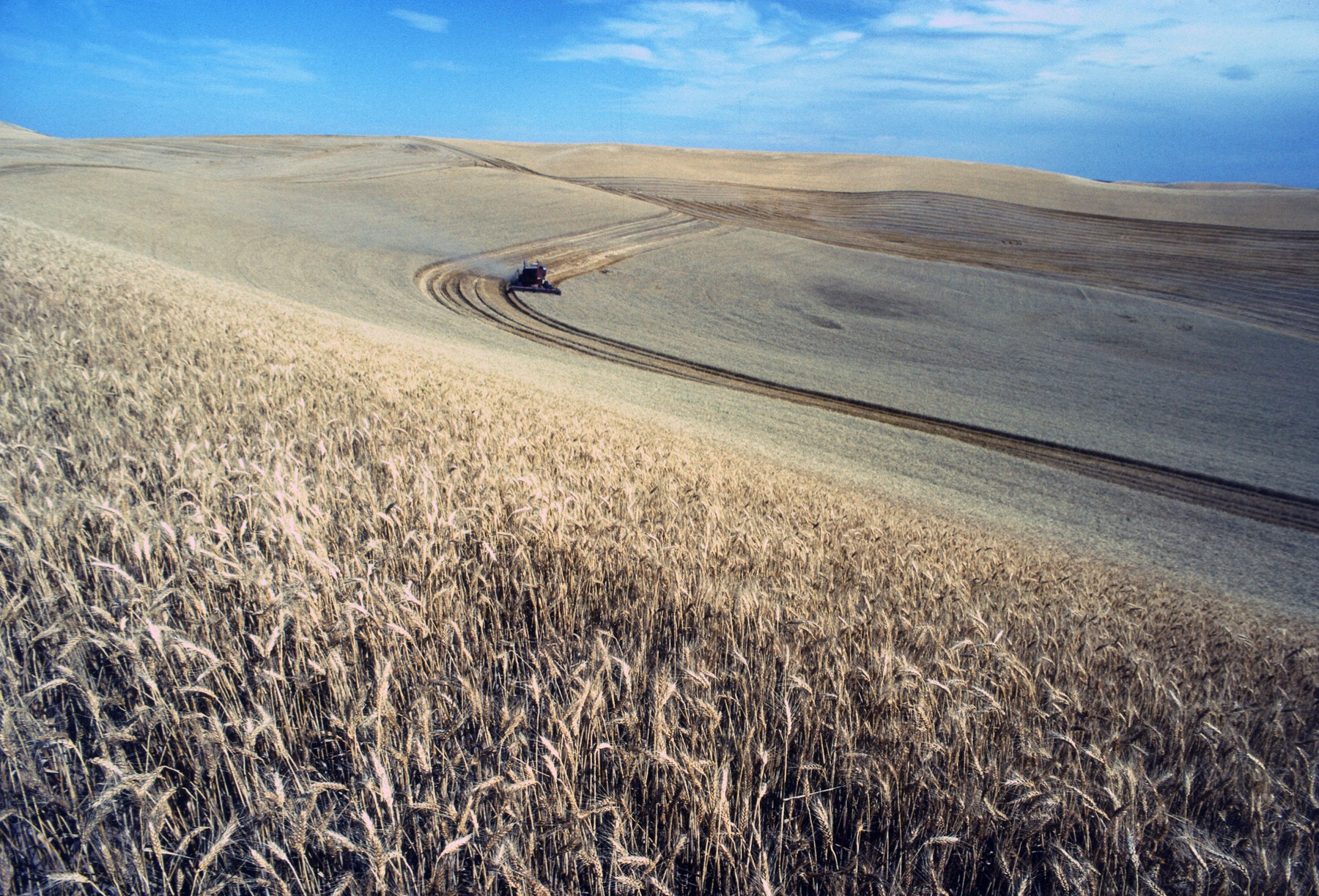
A good agronomist already has it all “under control”: by experience, by driving around, by instinct. The problem isn’t skill but scale and time. You can’t drive every hectare of several thousand, and a field is always uneven: one edge is stronger, another lags, a hollow is waterlogged, emergence is lost on a slope. An averaged decision on such a field is inherently suboptimal: somewhere you overpaid, somewhere you underdelivered. Space monitoring exists precisely to see and digitize that inequality.
Step one: see where the plant is short of something
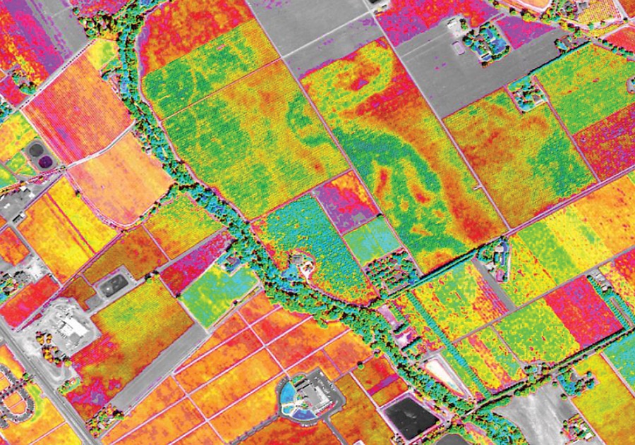
A crop’s condition is read from how the canopy reflects light. Greenness and biomass density show where the crop is vigorous and where it lags. There’s also a separate, subtler signal, the so-called “red edge”: a stretch of spectrum sensitive to nitrogen and chlorophyll content in the leaf. It’s by this that you can tell a field that looks even from one with a hidden nitrogen imbalance inside.
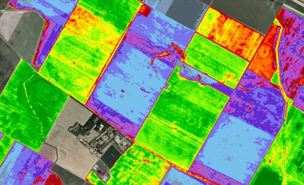
This is the key to variable rates. Instead of one number for the whole field you get a map: here are zones where the plant is strongly developed and an addition will give almost no response; here are zones where nitrogen genuinely limits growth and every unit will convert into yield.
An average rate over a field is always a compromise: overpayment on strong parts plus a shortfall on weak ones. A map of differences turns one compromise into a dozen targeted decisions.
Step two: turn the map into an application rate
Next, the condition map is translated into a task map for the machinery. The logic is simple and honest: more where the response to nitrogen is higher; less, or nothing, where the plant is already saturated or limited not by nutrition but by, say, moisture.
Here it’s important not to promise miracles. Variable-rate application doesn’t “create” yield out of thin air, it redistributes the same (or a smaller) volume of fertilizer to where it works and removes it from where it was burning up for nothing. The result isn’t magic but two clear things: fewer losses to over-application and a more even, predictable crop. Plus an environmental bonus: the surplus nitrogen not lost to over-application is nitrogen not lost to groundwater.
And one more honest caveat: the image sets the zones and priorities, but the specific doses the agronomist still ties to growth stage, variety, field history and weather. Space gives where and how differently; how much exactly remains a professional decision.
Step three: where the agronomist should drive
The second half of the value isn’t about fertilizer but about the agronomist’s own time and fuel. A condition map is essentially a list of addresses sorted by how alarming they are. Regular monitoring continuously compares the field with itself over time and highlights places where something changed: vegetation dropped sharply, a stress patch appeared, a whole zone is lagging.
Then a simple rule works: drive where the anomaly is, don’t tour everything. Scouting turns from a blanket drive-around into a targeted route through a few points. That’s a direct saving on fuel and, often more costly, on the agronomist’s working time in the hot season, when every day counts.
Early reaction matters separately. Many problems (a disease focus, trampling, an irrigation failure, a seeder miss) are cheapest to treat while they’re local. An image catches the deviation before it becomes noticeable “by eye” on an ordinary drive-around, and gives a head start of several days. In the field those days are sometimes worth a whole zone of yield.
Where the honest limits are
Space doesn’t cancel the agronomist and doesn’t make the diagnosis for them. An image reliably says “here it’s not like the surroundings” and “here’s how differently the parts developed”, but the cause of the anomaly (disease, pest, machinery, water) is most often confirmed on site. So the right model isn’t “satellite instead of a drive-around” but “satellite decides which drive-around you need”. First where, then why.
Just as honestly about the data: to see the dynamics you need regularity, and in the south cloud periodically tears it apart. Here a stack of layers helps: all-weather radar holds continuity where optical is silent, while the fine biochemistry is added by hyperspectral. A single source would leave gaps; the stack closes them.
What it gives the farm
- Nitrogen where it works. Variable rates remove over-application on strong parts and the shortfall on weak ones: the same fertilizer works more evenly.
- A route instead of a blanket drive-around. The agronomist drives to the anomaly points, saving fuel and, above all, time in the peak season.
- A head start in time. A problem is visible on the image before it is to the eye, and is treated while it’s local and cheap.
- Decisions per field, not “on average”. The field stops being one averaged object and becomes a set of zones, each with its own rate and its own priority.
From image to decision is a short path, if the picture has a continuation. Space by itself doesn’t apply nitrogen or drive the fields. But it turns “the field in general” into a map of targeted decisions, and that’s exactly the language in which fuel, fertilizer and yield are counted.