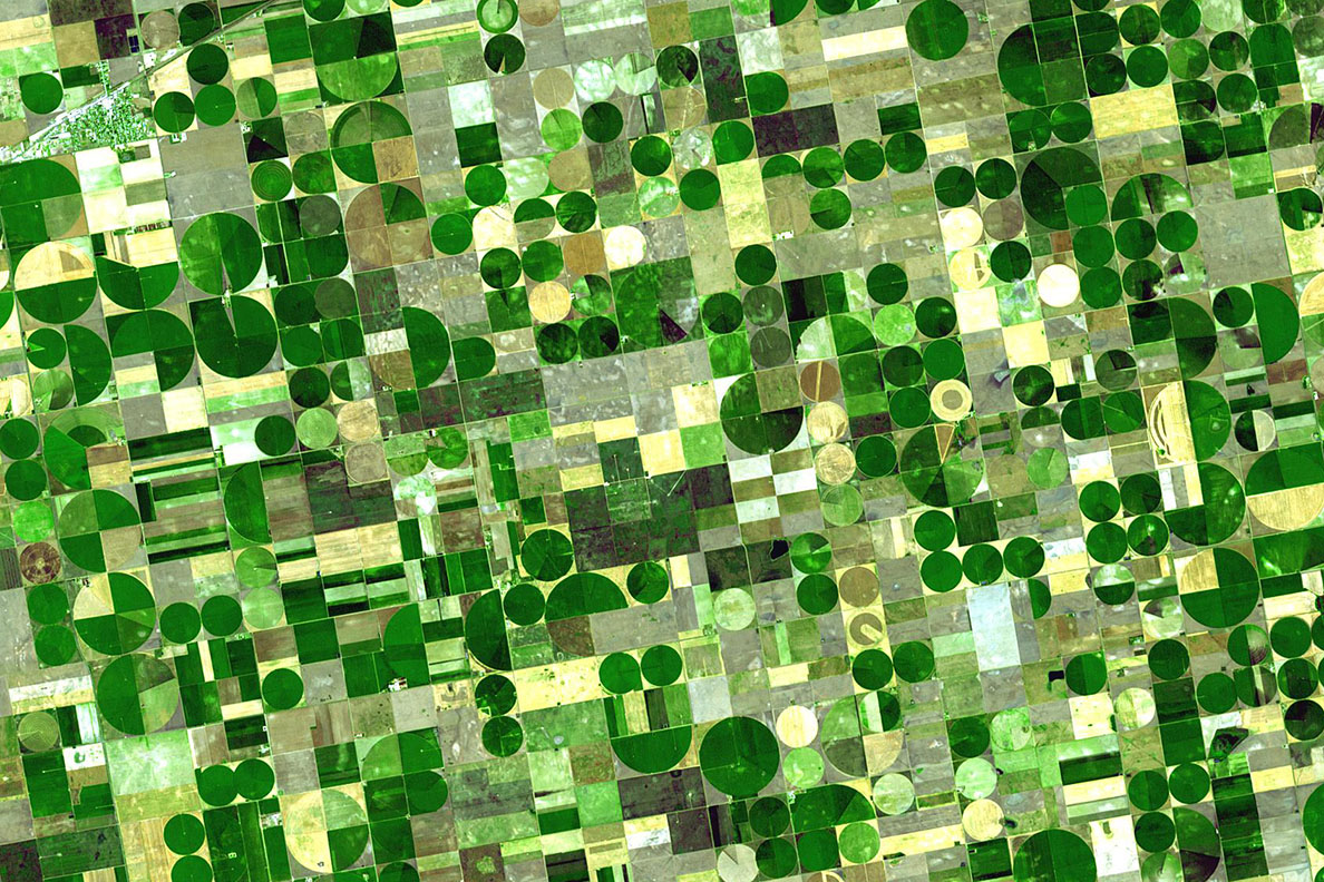
The human eye reads a field as “green” or “not so green”. A satellite sees dozens of shades of condition that only become visible to the agronomist two or three weeks later, when it’s already too late to intervene. Let’s unpack how light reflected off a plant turns into a crop-health map, and why the spectrum’s “red edge” tells you more about nitrogen than a walk-through ever could.
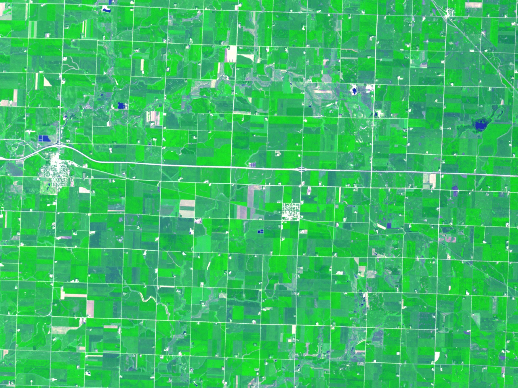
A field looks uniform. You drive along the edge, look at the even green carpet of winter wheat and conclude: all is well. But “green” is only the narrow band of light the retina can catch. A plant reflects and absorbs a far wider range, and it’s in the invisible part of the spectrum that the earliest information about the crop hides. A satellite reads that part directly. Where the eye sees a solid colour, the instrument sees structure: where the canopy is dense and where it’s thinning; where the leaf is full of chlorophyll and where the plant has already begun to starve.
Greenness as the language a plant speaks
A leaf isn’t just pigment, it’s an optical system. Healthy, actively photosynthesizing tissue behaves with light in a very characteristic way: it greedily absorbs the red light needed for photosynthesis, and at the same time reflects the near-infrared (the band just beyond the visible) sharply, many times more strongly. The stronger and healthier the canopy, the greater this contrast between absorbed red and reflected infrared.
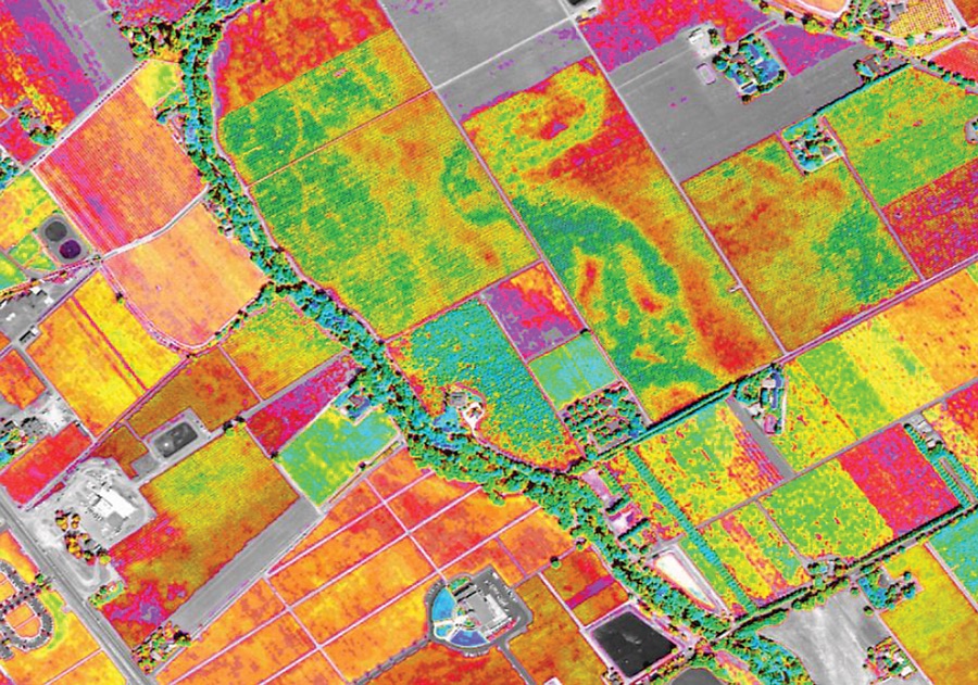
It’s on this contrast that what agronomic monitoring calls a vegetation map is built. It isn’t a “pretty green picture” but a measurable quantity: how much living, working biomass stands on each part of the field. The satellite passes over the fields and records this contrast at every point. Instead of one averaged impression, “the field is green”, you get a map that shows: here the canopy has closed and is working at full strength, and there, in a dip in the terrain, the plant is lagging, and that lag began long before it would be visible from the road.
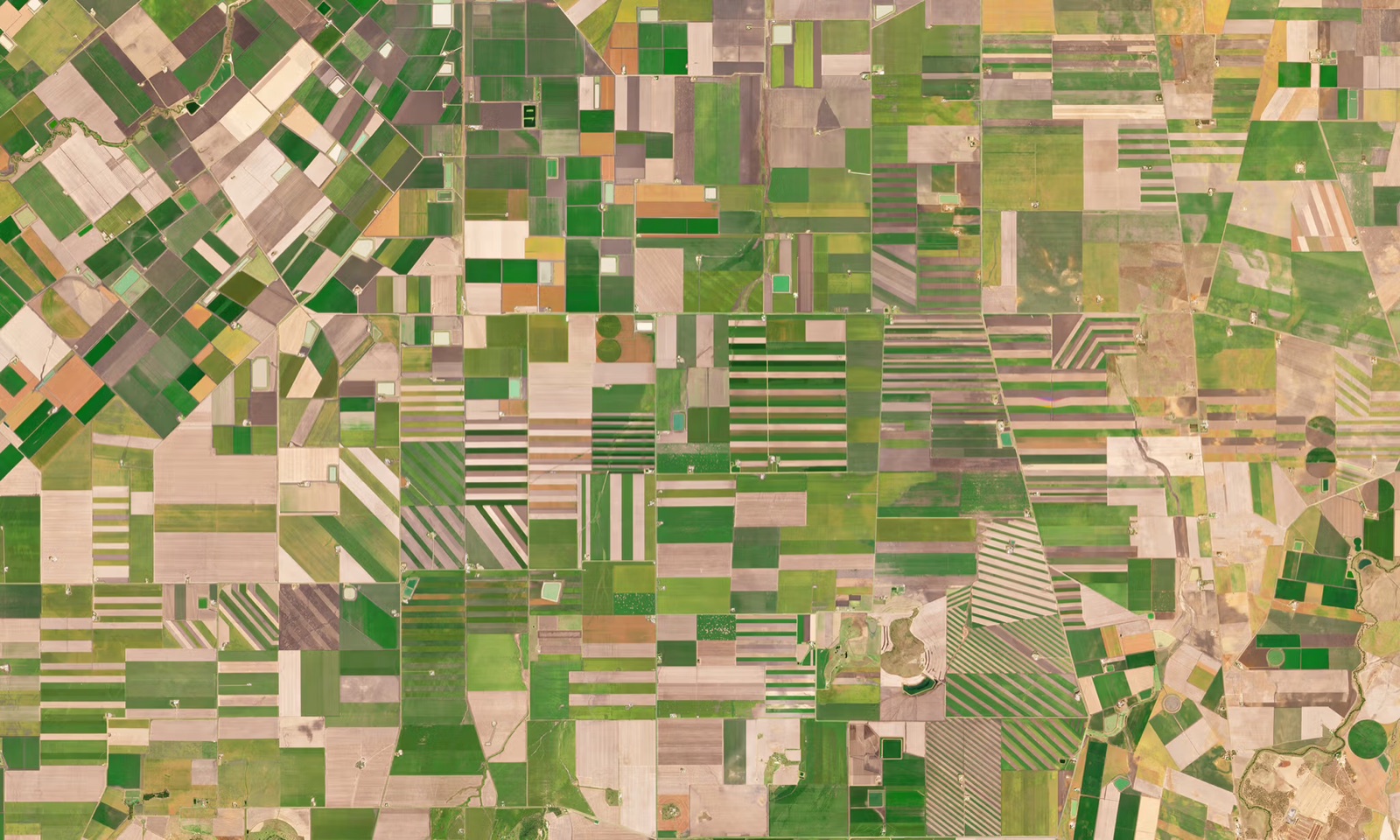
For the rain-fed farming of southern Russia (winter wheat, sunflower, rapeseed) this is especially valuable. Moisture is spread unevenly across a field, the terrain dictates where a deficit will arrive first, and a vegetation map shows this geography of stress right along the contours. A single drive across the field won’t show it: you’ll see the edge but not the centre of the block, and you won’t be able to compare today’s state with what it was ten days ago.
The “red edge”: where the conversation about nitrogen hides
If a vegetation map answers “how much living biomass is here”, the agronomist’s next question is: “is it getting enough nutrition”. And this is where it gets interesting.
Between red and near-infrared light there’s a very narrow transition zone called the “red edge”. It’s the place where the plant’s reflectance shoots up. And the position of that rise along the spectrum isn’t fixed. It shifts depending on how much chlorophyll is in the leaf, and the amount of chlorophyll is directly tied to nitrogen nutrition. A plant with enough nitrogen holds the “red edge” in one position. A plant that has started to starve shifts it long before the leaf yellows and it becomes visible to a person.
A yellowed leaf is no longer an alarm, it’s a record of what already happened. Nitrogen starvation shows up in the spectrum two or three weeks before it appears in colour. The only question is who reads that spectrum.
This is the fundamental difference between a person’s view and an instrument’s. The agronomist walks the field and sees the outcome: yellowing, thinning, lag. The satellite, reading the “red edge”, sees the process, the shift that predicts the outcome. Between those two moments lies a window in which top-dressing still works and yield loss is still reversible.
From spectrum to decision
The physics itself is beautiful, but a farm needs action, not physics. So a vegetation map and a nitrogen-status map aren’t the finish line but the entry to an agronomic decision. The map shows that the block is uneven: 70% of the field is developing normally while 30% lags, and the lag is concentrated in a specific zone. Then the agronomist decides what it is: a moisture deficit, a lack of nutrition, or perhaps a failure in sowing quality. But they decide it already knowing exactly where to drive and where to look, rather than driving hundreds of hectares blind.
It’s important to be honest: a satellite doesn’t make the diagnosis in the agronomist’s place. It replaces neither soil analysis nor the experience of a person who has worked this land for twenty years. It does something else: it removes the blind spots. It turns “the field looks fine overall” into “these eighteen hectares on the northern slope started lagging a week ago”. After that, the human works.
What it gives the farm
- Early warning. A problem is visible at the process stage, not the outcome: there’s still time to intervene while yield loss is reversible.
- Targeting instead of blanket treatment. The map shows which zones are lagging, so top-dressing and inspection can be aimed precisely, not applied at rate across the whole block.
- An objective picture of the whole. Not a field edge seen from the car window, but the entire block down to the last hectare, and in time: today versus two weeks ago.
- Saved trips and time. The agronomist drives where there’s a signal, rather than touring the whole farm checking things that are already fine.
- A conversation about nitrogen before yellowing. The “red edge” gives a two-to-three-week head start: the window in which top-dressing still works rather than recording what was missed.
The eye sees the field. The satellite sees its condition. The difference between those two views is often the difference between “in time” and “too late”.